Household balance sheets tell a story that headlines often miss. Two numbers do most of the work: how much people save, and how much debt they carry relative to income. When savings fall and debt climbs, resilience shrinks. When savings rise while debt stays manageable, households can absorb job losses, rate shocks, and sudden price jumps without breaking.
This is why I like tracking household savings alongside consumer debt burden across the 2000–2025 window. The timeline cleanly captures the big stress tests: the pre-2008 credit boom, the 2008–2009 crash and repair period, the low-rate decade that followed, and the 2020 shock that forced households and policymakers to re-price risk. Below, we map the trends, show how the ratios behave, and highlight what the newest data can—and cannot—prove.
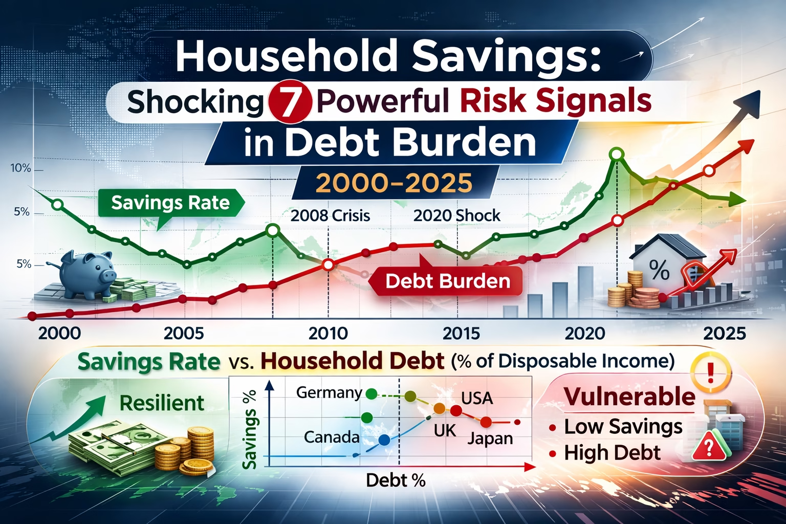
Data note: Charts use OECD household sector indicators (saving and debt relative to net disposable income) and World Bank context data where useful. Some countries may have gaps or a latest year earlier than 2025; gaps are left blank rather than filled.
AI summary
Snippet: Household savings vs consumer debt burden from 2000–2025: what the ratios reveal after 2008 and 2020, and where financial stress may be building next.
Here’s the core idea: household savings is the buffer; consumer debt burden is the weight. A strong buffer with a manageable weight usually signals flexibility. A thin buffer with a heavy weight signals fragility—especially when rates rise or employment weakens.
This article is built around three visuals:
- A dual timeline: household saving (as a % of disposable income) vs household debt (as a % of disposable income).
- A “savings-to-debt” lens: how quickly buffers grow relative to the debt load.
- A latest-year scatter: which countries sit in the resilient corner (higher savings, lower debt) versus the vulnerable corner (lower savings, higher debt).
Explore internal links: Personal finance data hub and Cost-of-living tracker.
Household Financial Health Data
What “Savings Rate” and “Debt Burden” Actually Measure
Defining the metrics before we dive in.
Before the charts, it helps to be precise about definitions—because “saving” can mean three different things depending on the source.
- Household saving rate (OECD concept) is typically expressed as a share of household net disposable income that is saved. In national accounts terms, it’s disposable income minus final consumption expenditure, plus the adjustment for pension entitlements (the pension adjustment matters; it can move the series).
- Household debt burden (OECD concept) is usually a stock measure: household liabilities (loans + other accounts payable) divided by net household disposable income.
- Consumer debt in everyday language is narrower than “household debt” (which often includes mortgages). Most cross-country “household debt” measures are mortgage-heavy, so the burden is often more about housing leverage than credit cards.
So when we compare “savings rate” and “debt burden,” we’re not comparing two similar things. One is a flow (% of income saved during a period). The other is a stock (the size of debt relative to annual income). They still belong together because they represent buffer vs obligation.
One more detail: the article window says 2000–2025, but the latest available year varies by country and indicator. Rather than inventing 2025 values, we treat “2000–2025” as the narrative frame and plot the data through the most recent reported years for each series.
The 2000–2007 Build-Up: Easy Credit vs Thin Buffers
The era that set the stage for the crisis.
2008–2012: Deleveraging, Forced Saving, and the Repair Years
The pattern flips post-crisis.
2013–2019: Low Rates, Asset Inflation, and a Quiet Debt Drift
How cheap money reshaped household behavior.
2020–2021: The Shock Where Savings Spiked (and Why It Matters)
A sudden break in the timeline.
2022–2025: Inflation, Rate Hikes, and the Debt-Test Phase
When the system becomes less forgiving.
Charts and Data: Savings vs Debt (How to Read the Signals)
Identifying the seven powerful risk signals.
What the Scatter Plot Usually Reveals (Resilient vs Vulnerable Corners)
The “at-a-glance” view of stability.
Analysis
The direction of travel is what matters most.
Frequently Asked Questions
Quick answers to common queries
Sources
Data and references used in this article
Short audio version of the blog:
Watch Video Below:
Made with NoteBookLM

Discover more from ThePolymathPursuit
Subscribe to get the latest posts sent to your email.