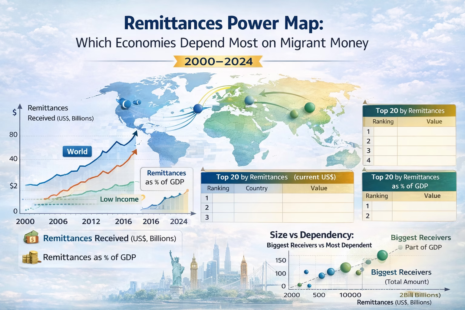
Remittances are one of those economic forces that look small—until you map them properly. A single number, like “total remittances received,” mostly rewards size: large economies and large diasporas naturally dominate. But a second lens changes the story: remittances as a share of GDP. That’s where dependence, household resilience, and macro vulnerability show up.
This “Remittances Power Map” separates big receivers (current US$) from most dependent economies (% of GDP) across 2000–2024. It also adds a simple idea I keep coming back to: remittances behave like a stabilizer for families, but they can become a constraint for countries if they’re the main external inflow keeping demand and FX stable.
Below, we’ll track the global trend, compare income groups, and rank the economies where migrant money matters most—then I’ll close with an honest first-person takeaway on what the data can and can’t prove.
Data note: Remittances and remittances (% of GDP) are from World Bank WDI indicators. Some countries have missing years; those gaps are left blank rather than filled. Context indicators (exchange rate, current account) help interpret sensitivity, not “prove” causality.
AI summary
Snippet: Remittances reshaped economies from 2000–2024. See who receives the most US$, who depends most (% of GDP), and what it means for stability and FX.
This topic works because it’s two stories in one:
- Scale story: which economies receive the largest remittance inflows in current US dollars.
- Dependence story: which economies rely on remittances as a meaningful share of GDP (a very different ranking).
The gap between those lists is where the real insight sits. Big receivers don’t always depend on remittances. And the most dependent economies are often not “big” in absolute dollar terms—but the inflows can be life-support for household budgets and the external balance.
Internal links: Global macro trends hub and Development finance tracker.
Remittance Data Power Map
What Remittances Measure and Why Two Rankings Matter
Separating volume from economic dependence.
When people say “remittances,” they usually mean money sent home by migrants to support family. In the World Bank WDI framework, the remittance indicator aggregates items recorded in balance of payments statistics (including personal transfers and compensation of employees, depending on the exact series definition).
For this story, the key is that remittances can be read in two very different ways:
- Remittances received (current US$): tells you where the biggest volumes land. This tends to correlate with population size, diaspora size, and the ability to channel transfers through formal systems.
- Remittances as % of GDP: tells you where remittances are economically “heavy.” This is the dependence lens: how large the inflow is relative to the economy’s overall output.
These rankings answer different questions. The first is about global flow concentration. The second is about vulnerability and resilience. Mixing them into one list usually hides the most interesting countries.
2000–2024 Timeline: Why the Global Remittances Line Keeps Climbing
The structural reasons behind the steady rise.
Income Groups: Where Remittances Are Big vs Where They Are Heavy
How economic scale warps the data.
Ranking A: The Biggest Receivers in US$
Where the bulk of the money flows.
Ranking B: The Most Dependent Economies (% of GDP)
Where migrant money is structural life-support.
Scatter: Size vs Dependency
Why two countries look ‘strong’ for opposite reasons.
Understanding the Data
How to interpret the interactive charts.
FX and External Stability
Why remittances interact with exchange rates.
Takeaway
Holding two truths at once.
Frequently Asked Questions
Quick answers to common queries
Sources
Data and references used in this article
Short audio version of the blog:
Watch Video Below:
Made with NoteBookLM

Discover more from ThePolymathPursuit
Subscribe to get the latest posts sent to your email.
VIP access? fb777viplogin better live up to the hype. I expect some serious red carpet treatment and maybe some exclusive bonuses. Let’s see if I can score big and feel like a high roller for a night. fb777viplogin
Jiliokcclogin, huh? Sounds kinda techy. Fingers crossed this login process is actually painless. Ain’t nobody got time for complicated stuff. Let’s see if the Jili party is worth the effort to get in! jiliokcclogin
Alright, so I gave pn777slot a whirl the other day. Gotta say, the slots selection is pretty decent. Not gonna lie, lost a few bucks, but hey, that’s gambling for ya! Check it out if you’re looking for some casual fun. pn777slot
Mmabetlogin is easy to use and navigate. It’s made it easy for me to log in and make bets when I want to. Click here to check it out mmabetlogin
Gotta say, funbetapp is pretty convenient. The app works well, and it’s easy to place bets on the go. Worth a download if you’re into that. See for yourself: funbetapp.
Gem79VIP, a VIP spot! Hope they got some gem-worthy payouts. I’ll check whether this spot has good prizes and big wins! Do your own research at gem79vip.